reMarkable 2: a magical disppointment
Contents
I’m obsessed with artifacts of the future.
Always have been. I didn’t save money as a kid. I blew every dollar I earned on electronics and computing devices. It’s a compulsion I’ve only slightly tamed in adulthood.
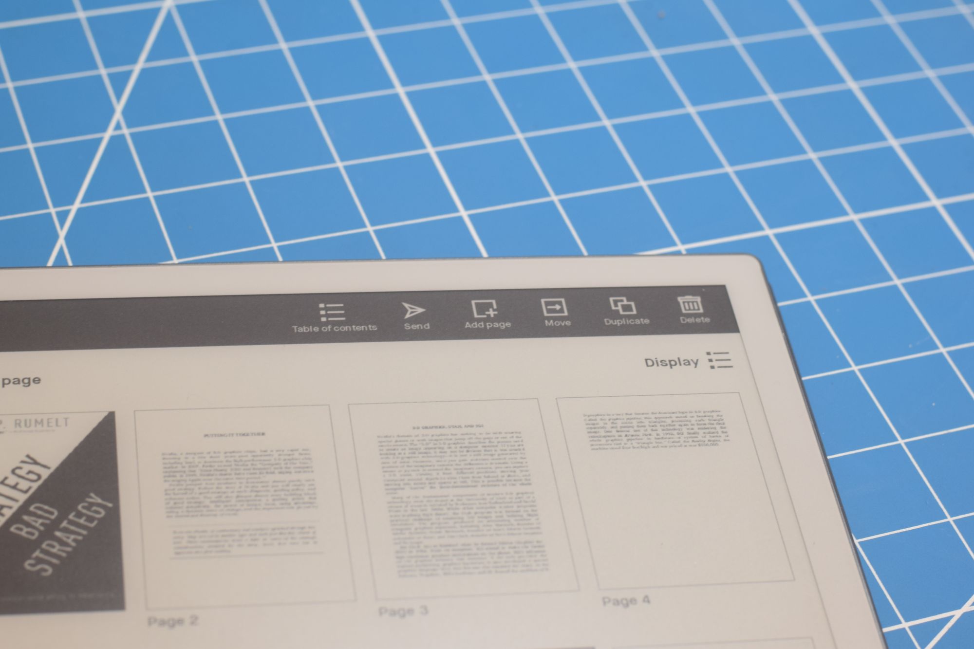
When I discovered reMarkable, it struck the futuristic note that captures my imagination. This is a digital notebook, storing as many pages of as many collections of notes as you can come up with.
It’s a frustratingly mediocre product.
But I love it anyway.
ePaper and the valley of mediocrity
Consumer devices have to climb out of mediocrity.
That journey can be painful, but what’s interesting is how much of it outsiders get to witness directly. When the iPad arrived, I had two competing thoughts:
- This thing is terrible. It’s heavy! It’s cold! I cannot stand how it feels to hold.
- This is incredible. It’s a Star Trek-level touch screen.
Tactile failures of the device lost to the power of its screen. I could live with the discomfort for the luxurious scale of all that multitouch. But I wouldn’t have to grit my teeth for long.
When the 2011 rev of the iPad dropped, everything terrible about it had been erased. It was thinner, it was lighter. It felt great to hold. You could snuggle up with it gladly on the couch or take a far-flung sweetheart to your pillow for a goodnight FaceTime call.
It was a comfortable companion, escaping mediocrity in the short span of just 11 months.
ePaper, meanwhile, remains stuck in the mud with no end in sight. There’s something greasy and disposable about any ePaper experience. It feels like newsprint. As mediums go, they’re spiritually similar: their goal is to produce a high volume of content as efficiently as possible.
Using ePaper is accepting:
- Ghosting of content
- Slow, flickery redrawing
- Periodic, Zamboni machine-like full-screen wipes to clean up
In exchange, though, you get a pleasant experience for consuming large amounts of information. ePaper feels like reading off of paper, hence the name. It’s about pigment that reflects existing light, not diodes blasting fresh light at you. Many find this soothing and restful by comparison to the typical high-speed screen. I certainly do.
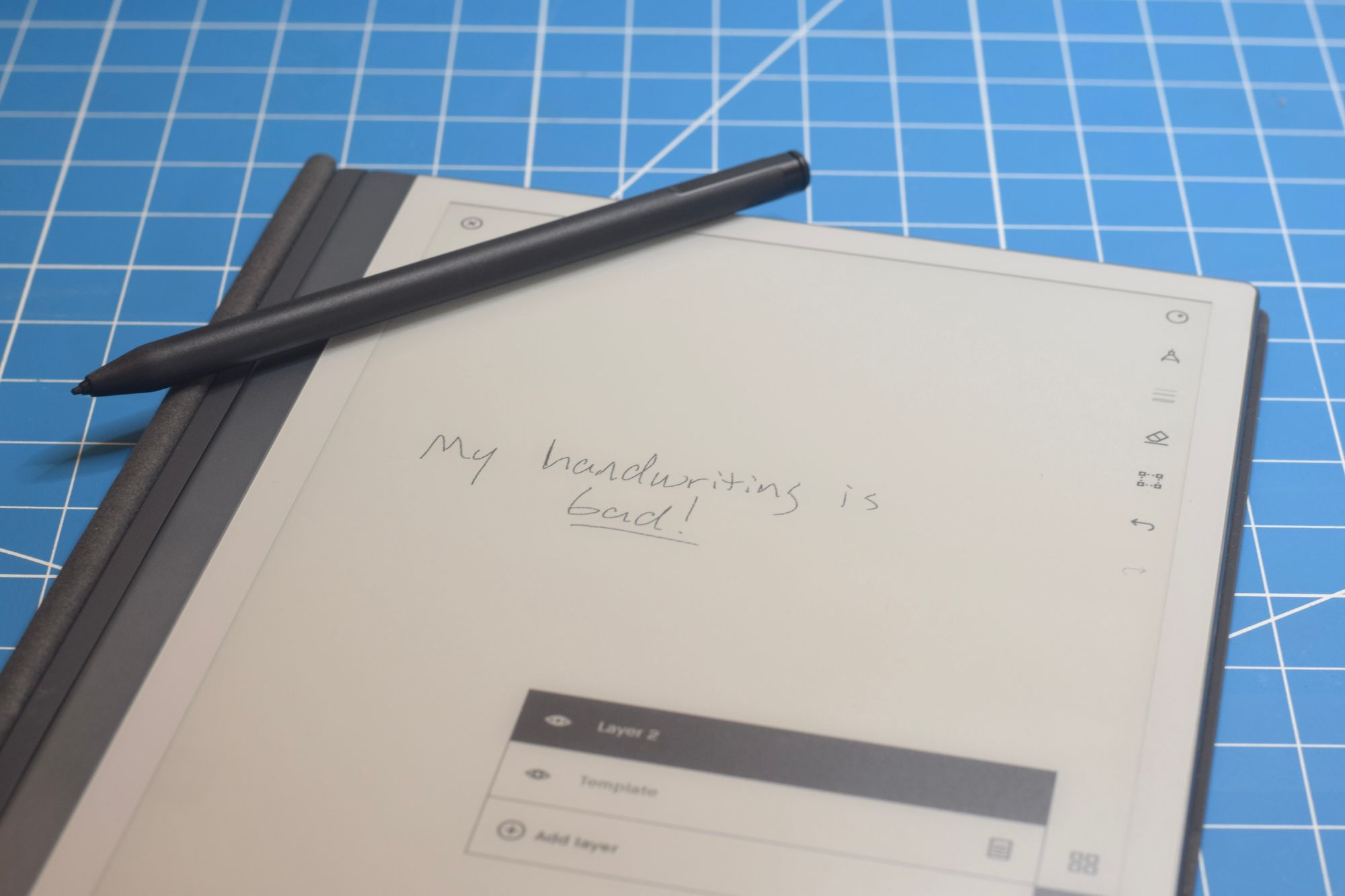
reMarkable uses ePaper to offer a satisfying drawing and writing experience. When you’re in the zone, stylus on the screen, there’s nothing mediocre to its ePaper implementation. You see instant results, like pencil on paper.

The rest of the time, though, the device feels constrained by the display technology. Even flipping pages has the barest delay, and these build up like sandpaper scuffs. Menus feel slow and flickery. I do my best to get in and out of the user interface contrivances as quickly as possible. They’re not pleasant enough to linger in, and that’s too bad.
Despite its imperfections, and its endless winter of mediocrity, ePaper is indispensable stuff. It’s more than good enough as part of a trade for bottomless, infinite notebooks.
Where things get heartbreaking is the software.
It’s just too bad
I’m going to focus on two pieces that really grate. They’re a missed opportunity for users and the platform alike.
‘Note: Custom templates aren’t supported on reMarkable 1 or 2.’
You have to be fucking kidding me.
We have the ability to create infinite notebooks to any structure or specification and your story for user customization is “well, maybe you could fuck off.”
That’s really sad.
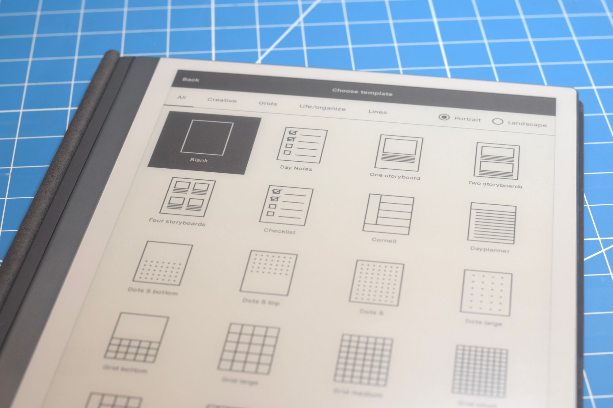
The neat thing with reMarkable notebooks is that you can combine as many templates as you want, in any order you want. It’s powerful. The platform provides a quite a few templates, spanning everything from graph paper to music notation to chemistry.
Of course I bought it anyway, and that’s because there’s a workaround. Due to dependence on GPL code, reMarkable is obliged to provide root access to its embedded Linux operating system. From here, the savvy tinkerer can drop in new template content if they’re willing to navigate:
- SFTP file transfers
- Multiple file formats (PNG and SVG)
- Tinkering with a JSON file
- Stopping and restarting the process that draws the UI, via
sshsession
It’s crummy, high-friction stuff. This should be a first-class feature. It multiplies the use cases and constituencies that could find a serious groove on the platform.
It’s up to the vendor to solve this one, and they’re asleep on the job.
Ugh, the sync is bad
Look, sync is hard.
When it’s time to implement sync, I’m out getting a sandwich. Call someone else. I’m not saying that I think this is easy to get right. I am saying that if you’re going to bill $8 every month for this single device to sync content, it needs to be as near to perfect as computer science allows.
reMarkable is not there.
In a perfect world, my notes would be safely in the cloud the moment I pick up my stylus from the screen. We don’t live in that world. reMarkable only seems to update its cloud state when I explicitly close a notebook. So if I push away from the desk to do something else, the reMarkable abandoned, nothing is going to be available for review off-device until I manually activate the tablet again and close out.
Just sad stuff.
Yet I love it anyway
reMarkable finds itself in an awkward position.
It is a mediocre implementation of a wonderful category: the digital, paper-like, bottomless notebook. I love this category. Writing by hand can really help my focus, but I depend on so many digital workflows. Being able to combine the two, without distractions, has a lot of power. reMarkable seizes on this magic, emphasizing that it is
The only tablet that helps you focus
This focus positioning—acknowledging the harried, distracted life that must attend anyone comfortable spending $300 on a digital notebook—appears on the website and again on the collateral in the package. It’s a savvy tack to follow: the subjective experience of this combined technology is what creates enthusiasm. It’s more than the sum of its parts.
Even those parts that are mediocre.
But reMarkable must be careful. In ages past, the early captors of magic thought themselves invincible. Blackberry—with its expressive, high bandwidth, qwerty text input and realtime messaging—is dust today. A much less mediocre expression of that category arrived in the form of the touchscreen smartphone. Apple, Google, Samsung and countless others dissolved a giant that defined a category.
In some ways, reMarkable feels more niche than smartphones. Then again, what could be niche about writing and drawing things by hand? It’s a problem everyone has. I can think of so many contexts for learning, studying, creativity and collaboration where a writing tablet like this would be less distracting and disruptive than a laptop or touchscreen device. Someone is going to try to sell this to more people.
For me and my uses, reMarkable 2 is worth every penny. But one of these days someone is going to build a much better take on this category, and I really can’t wait to trade up.
I hope I can give my money to reMarkable again when that time comes—they’ve built something charming here, despite its flaws.


